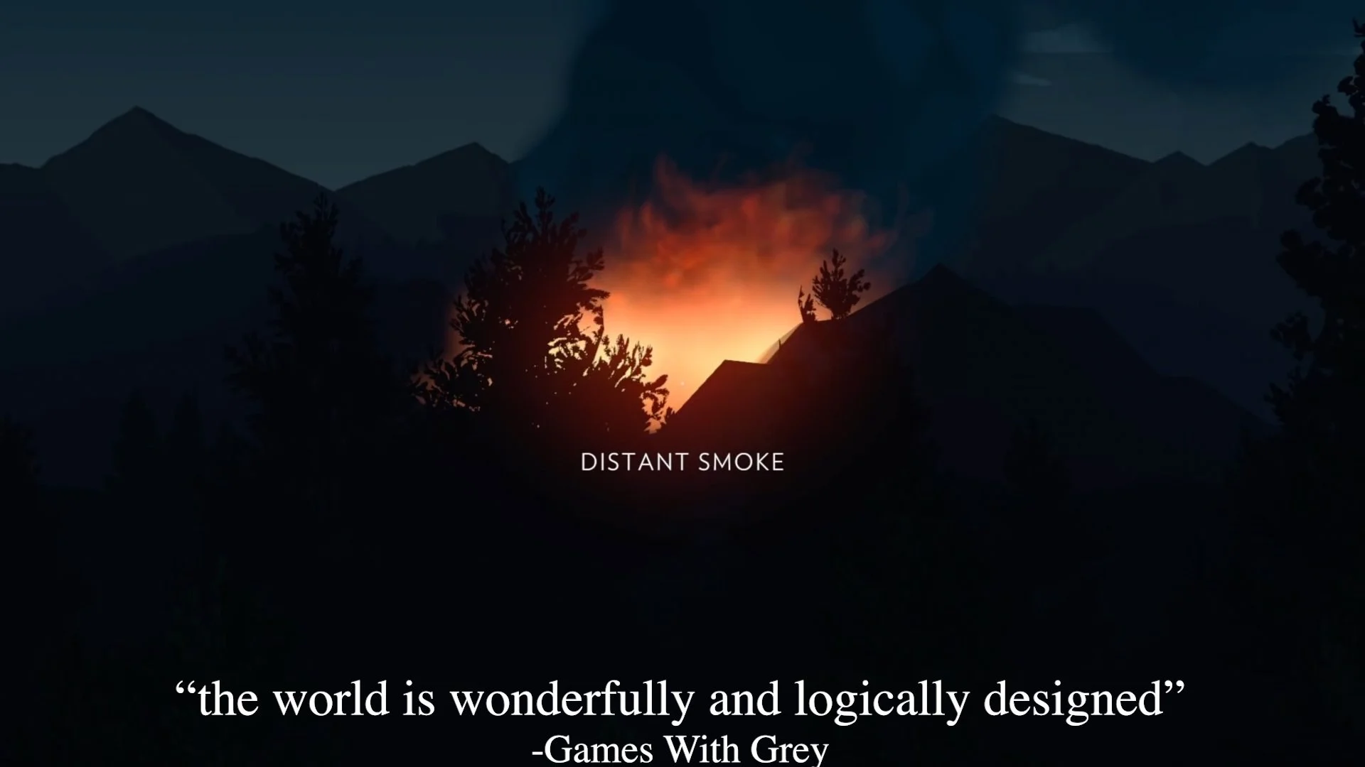
I Made the Worst Firewatch Trailer Ever
I watch a LOT of indie game trailers on my Twitch stream made by inexperienced and/or first time editors. And as instructive as analyzing them can be, I never want to drag someone through the mud, especially if they're still learning. So instead I made the worst possible trailer I could for Firewatch using the official trailers (the majority of which I made for work) as my raw material. I could make this trailer far worse than I did, but I didn't have the time to recapture the footage to make it the beautifully horrible creation it could truly be.
The only rule I gave myself when making this was to not do anything which I hadn't already seen done in a real trailer. There's always a way to make something worse, but it becomes less instructive if it's not informed by real life. For example, I could make it 30 minutes long, compress the footage to 240p, added star wipes, used Comic Sans, etc. But I honestly haven't seen trailers which were bad for those reasons. There's already plenty of ground to cover, so please witness my beautiful monstrosity and I'll walk you through each of the flaws I deliberately incorporated.
PROBLEM: From the first frame, the trailer is already a disaster. An ESRB rating taken from Google Image Search which is low-resolution, but matched with a crystal clear serif font for the descriptors. It's on the required 2 seconds, and has an unnecessary fade out.
SOLUTION: The ESRB rating is at the start of the trailer for a max of 2 seconds. The box needs to be at least 50% of the vertical height of the frame. If the trailer doesn't contain extreme violence, you can instead overlay the little ESRB rating icon during the first four seconds of the trailer. It's up to you whether or not you're ok overlaying the icon (which might be distracting) or putting 2 seconds of dead air at the start by using full screen version. Consult this page on my site for end slate specifications.
PROBLEM: The music I chose is from the game (which is good), but the track I chose doesn't change or have much of a rise in dramatic tension. Lots of game trailers fall into this trap of using gameplay music which sounds virtually the same at the beginning, middle, and end. This flattens out the trailer's pace and makes it feel like it's going nowhere.
SOLUTION: Find (or make) a track which has a good intro, middle, climax, and ending. If none exists, see if you can get one made. If you can't get one made, then look to license some royalty free music or music from a trailer music company. The Firewatch Reveal trailer has a really great custom music track by Chris Remo. I've written more about how to find the right music for your trailer in this article
The title card is bad enough but it overlaps the art so much, and will get covered up by video player progress bars.
PROBLEM: Over 15 seconds spent on logos!!! You might think this is drawn out to make it extra absurd, but I've seen game trailers which spend AT LEAST this much time on their logos. I'd say the majority of game trailers do this because it makes it look "real" or "official" when it's mostly just burning up precious time. Think of it this way: If the beginning of the trailer is what most people see, do you want it to be footage of your game? Or do you want it to be a bunch of logos?
SOLUTION: Start with gameplay and then show logos for no more than 1 second each. Or integrate the logo into your game footage in a clever and unobtrusive way. Only show the logos when you're legally obligated. Otherwise, save them for the end. For example, developers who use Unreal Engine are required to use the logo in their trailers, BUT they don't need to be shown at the start of the trailer, you can put it on the end slate.
PROBLEM: Opening shots which are pretty but don't show player controlled gameplay. I made a video and blog post about this topic just to say it's risky to do this for too long in the intro of your trailer. It largely succeeds in the Firewatch Announce trailer because of the strong visuals, good music, and top notch voice acting. If the shots don't show gameplay, they need to at least tell part of the story.
SOLUTION: Minimize use of debug camera shots showing the game environments. If I use them, I try to have no more than two debug camera shots at the start of a trailer and I make sure they don't take up more than a few seconds. If you want to show game environments, try to at least shoot them from the player perspective rather than a debug camera. At least one shot from the player perspective earns you some leeway to live in debug camera shots. I made a whole video about why these shots are a weak way to start a trailer.
There’s a flash frame that occurs during the dissolve. This is an example of minor (and easily avoidable) video editing errors.
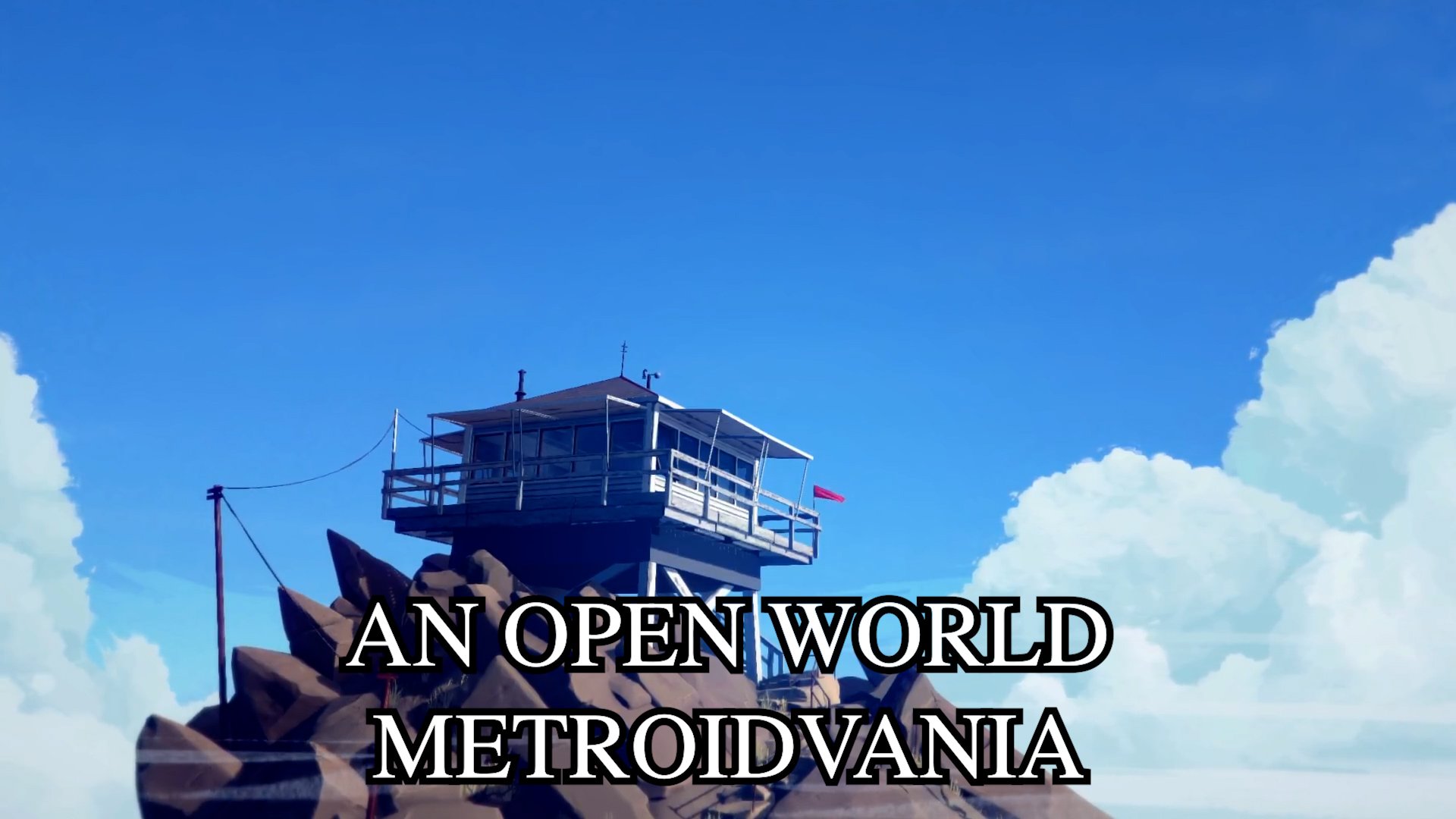
PROBLEM: Generic game descriptors which use specialized game dev jargon. Yes, technically Firewatch could be classified as an "Open World Metroidvania" because in the game there are some areas which are blocked off until you obtain a special tool which let you go past them. Is this the most interesting way to talk about Firewatch? Not really. People who enjoy Metroidvania games aren't generally looking for games like Firewatch to fulfill that need; they're more likely to be looking for a 2D side-scrolling platform game like Hollow Knight or Ori and the Blind Forest.
Throughout the trailer I also peppered in feature-based title cards like "Fully voice acted" and "Single player story campaign." These are all technically true, but to put so much attention on features which are not unique to Firewatch makes it sound like Firewatch doesn't have anything special worth calling out. Imagine if your parent was setting you up on a date and they said to the date: "My child like to eat food, watch TV, sleep, and they have hair!"
SOLUTION: Don't use title cards at all if you don't have something interesting to say with them. Or write better title cards which sound like your game and your game only. But whatever you do, don't talk about your game in a way which makes it sound very generic.
At an egregious 36 seconds in is the first shot of apparently player controlled gameplay.
PROBLEM: Excessive crossfades. I frequently see this from inexperienced trailer editors. When asked, some of them say they want the trailer to feel smoother, so they use crossfades. Instead, what it tells me is they're not considering the language of film editing. Crossfades have a very specific meaning in editing which is not their intent in cross fading between all the shots. It,s as !if "I* were to impro-perly use .punctuation wh'ile writing:
SOLUTION: Try to stick to mostly stick to straight cuts and use techniques like eyetrace and match cuts to make edits smoother. Straight cuts are capable of meaning SO many different things, but crossfades are much less versatile. Crossfades! Are! Like! Exclamation! Points! You! Pretty! Much! Use! Them! For! One! Purpose!
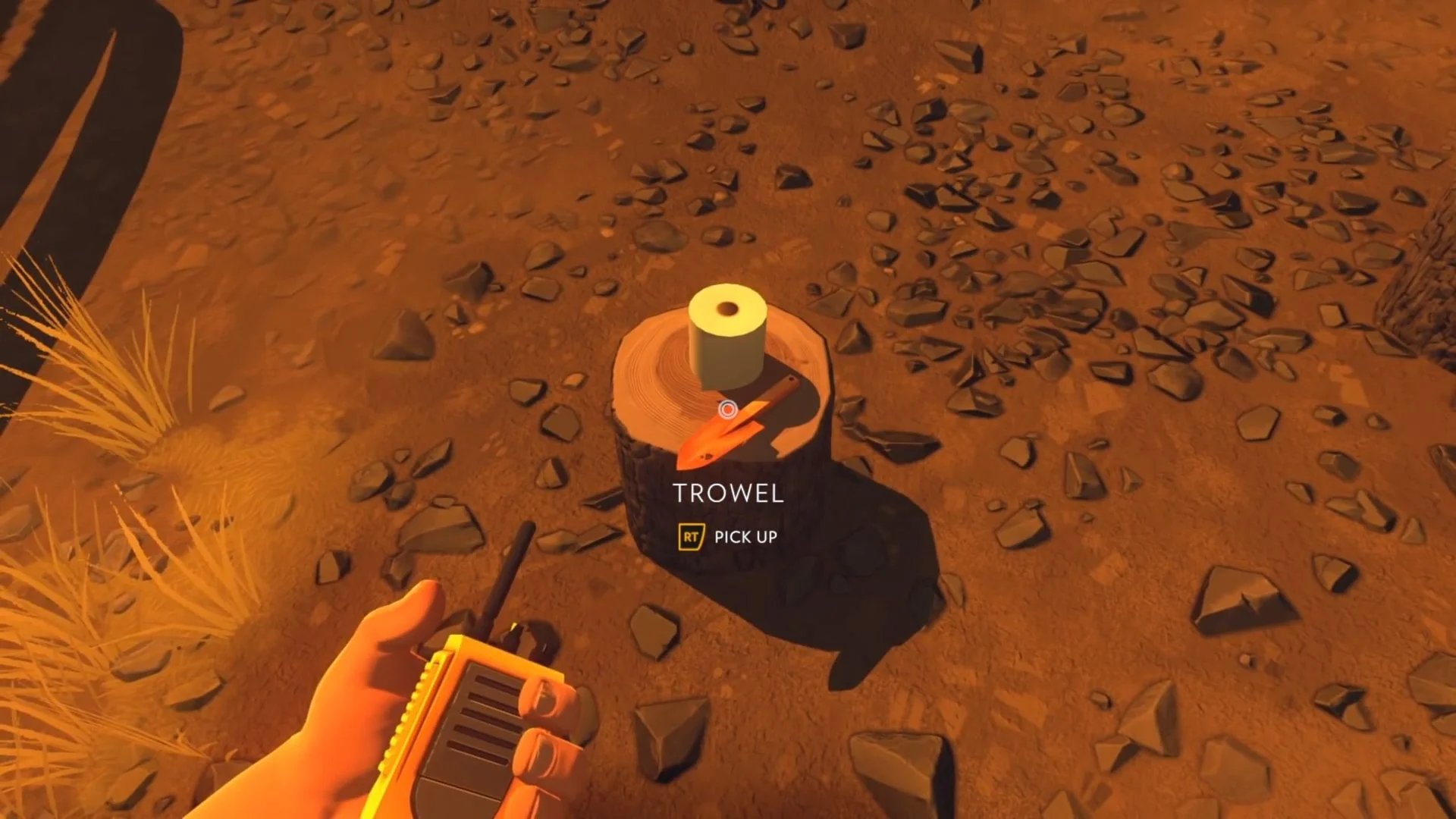
PROBLEM: Random dialogue and story scenes. The scene from Firewatch where Henry finds a poop trowel doesn't tell us much of anything about the overall story of Firewatch because it's so specific to this one scene. If this scene were entirely removed from the game, the overall plot would not be affected, so it doesn't carry much weight in the trailer.
SOLUTION: Choose scenes and dialogue which provide information about: the world, story premise, plot, conflict, mystery, or the character's relationships, wants, and needs.

This shot is so ridiculously overloaded with information. I’ve seen frames like this in both indie and AAA game trailers.
PROBLEM: Too much text on the screen competing for attention. At 41 seconds the shot has both a dialogue selection screen and a press quote which is two lines long. When you make the audience's go back and forth between two competing elements on screen, they're going to at best get about half the information from both. But I think it's more likely you'll get even less because your eyes are either going back and forth or just picking on.
SOLUTION: If you include text in the trailer, make sure the text is the only thing you want the audience to be paying attention to. Or at least, be okay if the non-text items are only sort of paid attention to. This goes for either the accolade or in-game text. Reducing the cognitive load of the audience will make all the information more likely to be seen and retained.
PROBLEM: Text is outside of the title safe region and difficult to read. I monstrously put the text flush with the bottom of the frame where it's absolutely going to get cut off by progress bars on YouTube or social media sites. There's also no drop shadow or stroke around the text, and serif fonts are generally best used in print, not on digital screens.
SOLUTION: Use your video editing software's action/title safe reference guide to make sure text is within those boundaries so they'll be readable. And make sure there's sufficient contrast behind the text so it's readable on screen. If you need to darken the background, add a stroke, or drop shadow.
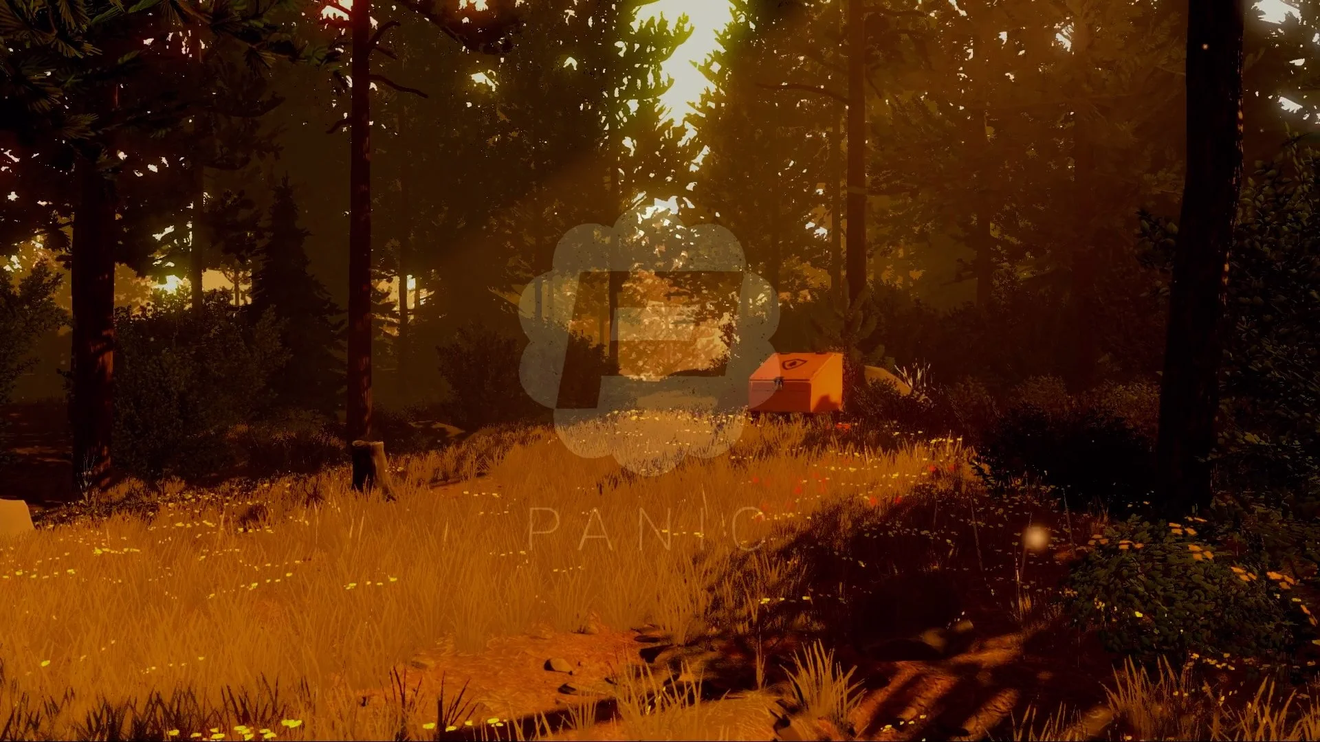
Not only is this a bad title card, but the shot doesn’t even show any secrets!
PROBLEM: Press accolades stay on screen across multiple shots. Not only does the accolade distract from one shot, it distracts from multiple shots!
SOLUTION: Use only one shot for quotes unless you've figured out some clever way to integrate them into multiple shots. Also, don't use quotes that are longer than two lines; it makes it much harder to read (this goes for captions, too!)
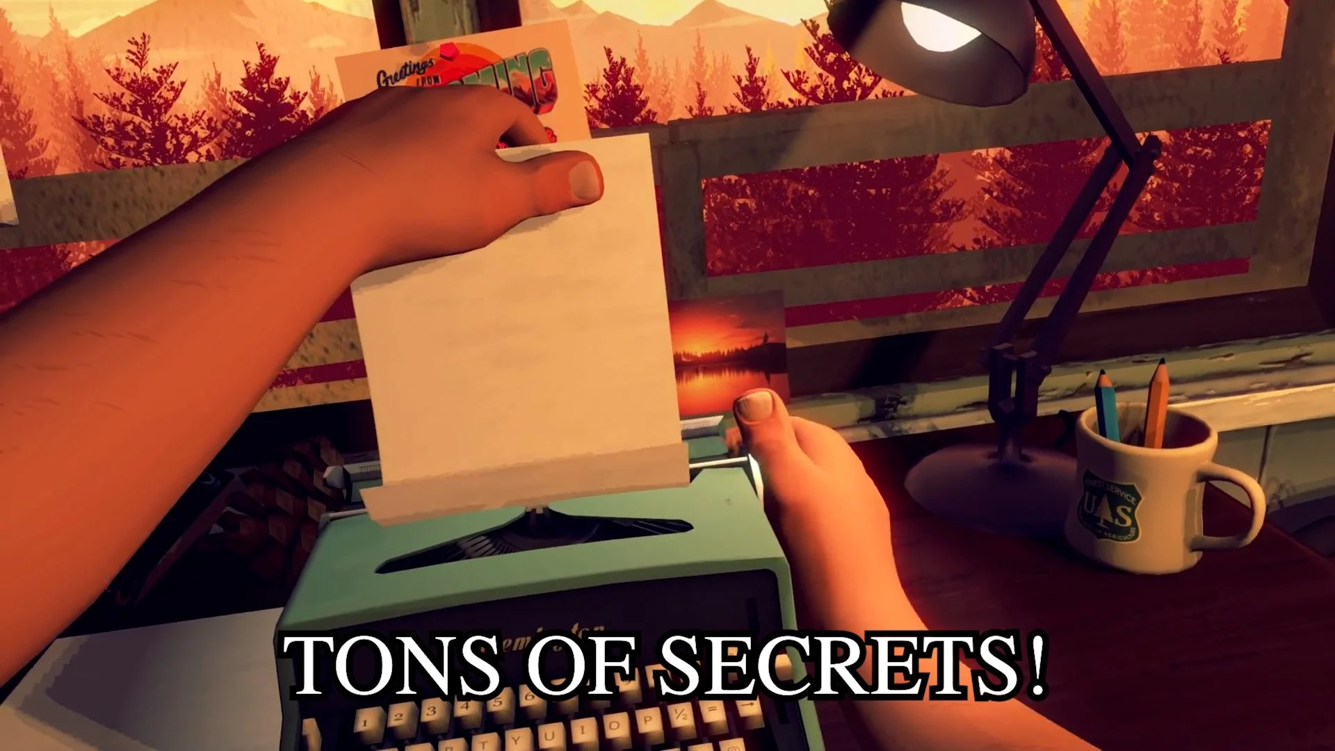
PROBLEM: "Reactive Musical Score" and "Tons of Secrets!" is a very boring and generic way to talk about your game. Listing a bunch of features is a quick way to make your game sound like hundreds if not thousands of others. As quoted so succinctly in this GCAP talk by Jack Railton-Woodcock From Lumi Interactive: People care about the flavor, not the ingredients. Talking about game features is talking about the ingredients.
SOLUTION: "Reactive Musical Score" isn't something you can really show in a trailer, so I'd just not mention it at all, and if the game has secrets, then showing them is much better than saying they're there. You might even be able to get away with showing something which isn't technically a secret, but reads as a secret to someone watching the trailer. There lots of conventional places to put secrets in games, such as behind waterfalls, so something that reads similar could work great.
This is a terrible quote that says virtually nothing about the game. You want your press accolades to contribute to the audience’s understanding of the game. Ideally, it’s something more qualitative than: “The game is good!”
PROBLEM: Using the game menu as the title screen. Just don't do this unless your title screen is well composed for a trailer end slate and doesn't have things like: "NEW GAME" clearly visible.
SOLUTION: Make a custom end slate which has the most important information as the biggest thing on the screen, and the second most important as the second biggest thing, etc.
PROBLEM: The trailer shows a bunch of footage, but in a way which doesn't represent the experience of the game. Even when game trailers aren't this bad, they can still fail at representing the game. In those cases, the audience is forced to "see through" the trailer's bad editing and focus on the raw gameplay clips it contains. When there's no narrative structure that's pretty much all you can do (other than stop watching).
PROBLEM: No call to action and excessive social media icons. For the very last shot of the trailer I put a full URL including the https://www. and a bunch of google image searched social media icons without the usernames for each one. I wish I could say I was making this up, but I've seen game trailers that do this. Sending people to your social media is like trying to make people move OUT of your marketing funnel.
SOLUTION: Keep the call to action as simple as possible and put something simple like "Wishlist on Steam" or a date, and with the logos for the platforms and consoles it's on. Don't send people to your social media accounts. Your website, MAYBE, but even that is just adding more clicks that could be spent wishlisting the game.

Forgive me for making this end slate. It hurt me to make it as much as it hurts you to look at it.
SOLUTION: This is the million dollar problem that is the most difficult thing to solve, because every game has its own unique needs. Even games which are ostensibly the same need to have different creative direction for their trailers, because if one comes first, the second one has to take that into account.
I always strive to make trailers which either represent the feeling of playing the game, or just the feeling of the game's story. I wish there was an easy way for everyone to figure this out for their own game, but at minimum it starts with finding the hook of your game and going from there.
Trailers are an opportunity for a game to look the best it can possibly be. When a trailer doesn't at least match the quality of the game it can be like opening a fine dining restaurant with an amazing menu, but serving at plastic tables, with plastic utensils, paper plates, and inexperienced waiters who really don't want to be there. The quality of the trailer can bring down the perceived production value of the game. This is why I think every game deserves a good game trailer to at least get a fighting chance to succeed!
