25 Simple Tricks for Better Motion Graphics
I'm an editor by trade, not a motion designer which means I wish I wasn't the one writing this article or the one who made the video, because I know there are more qualified artists out there. I make gradual improvements to my After Effects skills, but I don't feel comfortable selling myself exclusively as a motion graphics artist. That said, I think more lists like this should exist especially for people just getting started in motion graphics. This is a collection of techniques that I noticed overlap in a lot of video tutorials that I've watched over the years. This isn't the be all and end all guide BY FAR, nor is this intended as a full tutorial.
As with anything, how you artistically use these is what ultimately makes your graphics look good. It's not a full on recipe, but it is a list of ingredients. It's up to the artist (chef?) to decide what ingredients will best serve the piece.
I'm writing this for the beginners just starting out, seasoned vets will look at this and say "Yup, pretty much" but not get much else out of it.
For the majority of these techniques I didn't use 3rd party plugins, but didn't specifically make a point to avoid them. Again, not a video tutorial.
Enjoy!
--
Okay, so a few simple observations that I've made about how to make motion graphics look better.
First off, the thing I've noticed about good motion graphics is that it's never just putting all the effects together willy nilly. Usually it's about adding "flaws" whether by making the titles look chipped with a texture or making sure that the motion isn't too uniform (e.g. animation that eases in/out, bounces etc). Usually when you first start out, the graphics look too "clean" or at worst don't look like you used After Effects at all.
Computers by themselves do things very neat and robotically, so it's up to the artist to make things more dynamic. Also, for animation tips, watch this great video: The Basics of Motion Design.
Let's go through each of these one by one and I'll explain as much as I feel is necessary. I'm not going to write out all the instructions here, so if you're confused then get Googling. I think people learn better when they figure out the basics of what they need to do and then Google around. If someone tells you exactly what buttons to push then it often doesn't absorb because you're just following instructions.
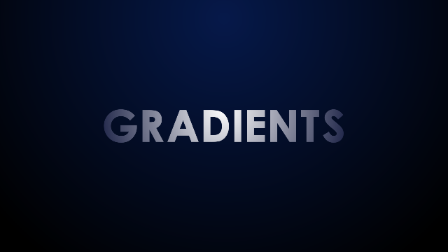
1. Gradients At the most basic level making backgrounds and text not completely uniform in color adds a bit of depth and shape. A radial gradient ramp is one simple way to do this. Basically, avoid making the graphics look "flat" unless it's an aesthetic choice for something like an infographic.

2. Vignette Vignettes are used damn near everywhere you look to focus attention, whether it's in motion graphics, color grading, video games etc. A vignette can easily be made by creating a dark solid with an inverted circular mask, then feathering the mask and adjusting with the opacity. You can also play with colors and transfer modes for different looks too.

3. Textures Textures are one of the easiest ways to make your titles look more interesting. One way is to just pre-comp your text, put the texture below it and set the texture's track matte to "Alpha matte." There're TONS of free textures online if you just Google for them.

4. Color Grading Color grading is an industry unto itself, but adjusting the color to the right feel for your titles goes a long way. There're a GAZILLION ways to do this in After Effects whether just making some curves effects, adding a tint effect, overlaying some color solids, or using 3rd party plugins.

5. Shadows A simple drop shadow will add some depth to your titles. I took this particular technique from Video Copilot's Ancient Titles Tutorialwhere he copied the text, made the bottom layer black, added a CC Radial Blur and moved the center of the blur up high to make it look like the light source is above the title.

6. Contrast Damn near every tutorial I ever saw for motion graphics added a "contrast curve" at one point or another. Just use the "Curves" effect, raise the highlights and lower the shadows to create an "S curve."
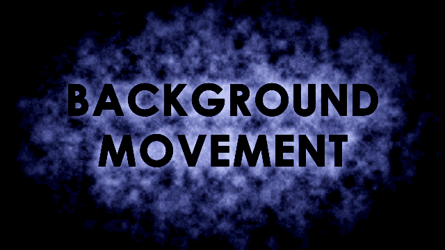
7. Background Movement They're called "motion graphics" aren't they? Any sort of movement in the background generally makes them more interesting to look at. I used some animated fractal noise here. This look is modeled off of Nawaz Alamgir's 30 in 30 motion graphics video. There are lots of ways to add background movement. Lots of movie trailers use a scaled up blurred image that's panning sideways.

8. Glow There're a lot of ways to add glow. There're the built in glow filters and lots of 3rd party ones out there like Trapcode Starglow or some in Red Giant Universe. The technique I used here I learned from School of Motion's tutorial where you duplicate the thing you want to make glow, set the transfer mode of the top layer to "Add," apply a Fast blur effect, and then adjust the blur and opacity as needed.

9. Light Sweep You know, that thing that makes the text look shiny? There's a built in CC Light Sweep effect in After Effects that does this quite easily where you just have to mess with some settings and animate its position. For this I did it the "hard" way by making my own light sweep from a white solid, matting it to the text etc.
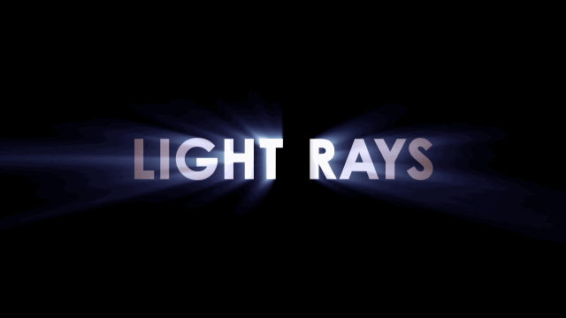
10. Light Rays I used Trapcode Shine here, but there are some built in light ray filters and also Video Copilot has a tutorial about making 3D light rays. Also, if you're going to use Trapcode Shine, do yourself a favor and change the default color settings, EVERYONE who has used Trapcode Shine will recognize the default colors.

11. Lens Flares Want some quick titles? Then just do what a large percentage of movie trailers do, make some metal looking text and add a tiny lens flare underneath it. Maybe with a larger one flickering off camera too. I think most people use Optical Flares from Video Copilot but there's also Knoll Light Factory.

12. Slams Just about the most basic title animation you can do. When I first started, I animated the title's scale from big to 100%, but now I change the text to a 3D layer and animate its Z-position. The scaling looks better and you can get that "flying from past the camera" look.

13. Motion Blur It's a simple switch right next to every layer. Just make sure the sampling is set high enough so that you don't see gross looking "steps" in the motion blur. Or set the shutter to a different angle. The lower the shutter angle, the less motion blur (think Saving Private Ryan).

14. Staggered Animation Generally if individual elements animate onto the screen one after another it looks more interesting. I use pt_ShiftLayers from aescripts + aepluginsif I have a ton of layers animated, and I need to stagger them by a certain number of frames. Also here I used DecomposeText to separate the letters.
EDIT: Several people were quick to point out that this is easier done with the text animator effects. At the time I made this I knew how to use the text animators but didn't know how to add that nice graph editor motion curve easing to the individual letters. I've since been taught about the easing functions in the "Advanced" section of the text animator. Please comment if you have more tips, because I want tips too ;)

15. Graph Editor
This one took me too long to start using, but it's another that falls into the camp of making motion not too uniform. Basically once you've animated a property like position, change the keyframes to "easy ease" keyframes" and go into the graph editor and then move one of the bezier handles for the keyframes all the way to the other side, this will either make the animation super fast then slow, or slow and then fast. Pretty much all those super slick looking infographics mess with the graph editor to make the motion more interesting and less robotic.

16. Bounce There are a few ways to make this sort of bouncing animation. One is Ease and Wizz from aescripts + aeplugins.
The other is this inertia expression from mograph.net which you can add to animation properties like position, scale or rotation.
// n = 0; if (numKeys > 0){ n = nearestKey(time).index; if (key(n).time > time){ n--; } } if (n == 0){ t = 0; }else{ t = time - key(n).time; } if (n > 0 && t < 1){ v = velocityAtTime(key(n).time - thisComp.frameDuration/10); amp = .01; freq = 2.0; decay = 11.0; value + v*amp*Math.sin(freq*t*2*Math.PI)/Math.exp(decay*t); }else{ value; } //
Change the "amp" number to make the amplitude of the bounce bigger or smaller. Change the "freq" number to make the number of bounces higher or lower Change the "decay" number to change how quickly the bounce stops (higher numbers make it stop faster, lower make it longer)
18. Mattes There're tons of ways to make mattes but in general it boils down to making a layer that somehow goes from black to white (or vice versa) in some sort of animated style. Whether you're using stock footage of some ink bleed thing, or making your own special transition using animated shapes. Learn about track mattes and masks sooner rather than later, they're used EVERYWHERE. This was made by using a Video Copilot Riot Gear ink bleed matte.

17. Color Transitions Lots of cool infographics do these sorts of color wipes using track mattes etc. I made several versions of the text with different backgrounds. Then I made track mattes of various kinds by doing things like animating a thin black solid and scaling it up to transition from white to black. The first transition is modeled after Kert Gartner's trailer for the game Hundreds. The second transition is a staggered animation of some rectangles scaling up.
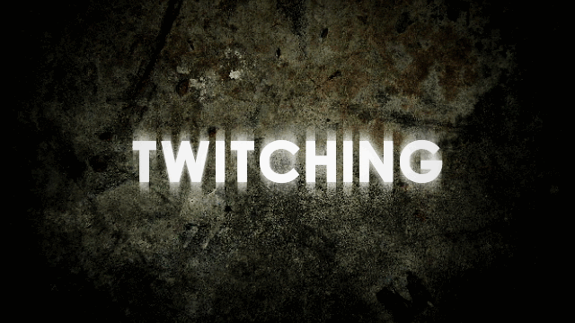
19. Twitching Lots of titles use some sort of random interval twitching especially for sci-fi and horror stuff. For these I used Evan Abrams' Twitch expressions tutorials. I made the scale and position twitch randomly and then made an adjustment layer to make stuff distorted and made the opacity of that adjustment layer twitch so that the distortions would happen randomly. There's also Video Copilot's Twitch plugin. For the RGB separation and TV distortion I used plugins from the TV Distortion bundle.

20. Particles Not really a "simple" technique but particles are damn near everywhere in motion graphics. Whether you're using CC Particle World which is built into After Effects or you purchase Trapcode Particular,learn how to work with particles. There're sooooooo many settings to these effects that the sooner you start, the sooner your stuff can look better. I know I haven't even scratched the surface myself. For this I used Particular and also Trapcode Shine with the ray length turned to zero in order to add the coloring.

21. Compositing Sometimes you just need to put some real life stock footage stuff with your graphics to make them look better or more "real." Whether it's fire or some smoke hits to make it look like your title had impact. This is one thing where you pretty much have to buy stock footage of some kind because it's probably going to be cheaper than blowing stuff up on your own and then creating your own elements. Most people have Video Copilot's Action Essentials pack.
For this I just added some dust elements and a fire element. Then I animated a mask to transition from the white text to the red.
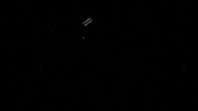
22. Camera Movement Sometimes a simple title slam isn't interesting enough, maybe you want the camera to twist a bit or have it not be perfectly centered. Lots of ways to add camera movement to spice up the graphics (for more about 3D cameras there's this Video Copilot tutorial).
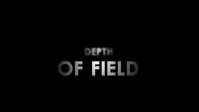
23. Depth of Field While you're working with 3D cameras why not switch on the depth of field so that not everything is uniformly in focus? Or track back from one title to another and have the second one come into focus? Just have to offset your 3D objects, activate depth of field on your camera and then adjust your aperture. Remember, small apertures means more depth of field and large apertures means less depth of field.

24. Camera Shake This one falls under the category of adding "flaws" where you make the camera shake to add impact to your titles. For this I have all the elements as 3D layers and a camera layer parented to a null object layer. Then a wiggle expression tied to a slider control on the null object so that when the title hits everything wiggles and then stops.

25. 3D Text
Okay again, not a SIMPLE technique but everyone likes 3D text. You just have to pick the technique you want to use because there are tons of ways to fake it or do it for real in After Effects especially now that Cinema 4D Lite is bundled with After Effects and After Effects has its own ray-traced 3D mode. For this one I used Video Copilot's Element 3D which is dirt simple to use.
So that's it! Some "simple" techniques for beginners getting into motion graphics. If this helped you at all please leave me a comment! Hopefully I can help some AE beginners out there. I know I wish I had an article like this when I first started learning AE. If you have questions leave a comment, otherwise I suggest you start Googling and figuring out how to use these sorts of things in your projects!